Part 4 Mapping with R and {sf}
This document is based on a notebook about R spatial analysis included in the project OSGeoLive
It aims to provide a quick introduction to R spatial analysis and cartography.
R is a language dedicated to statistics and data analysis. R has also a lot of strong and well tested packages for spatial analysis. Recent packages like {sf} allows easy Simple Features manipulation.
Please note that you will need several spatial libraries (GEOS, GDAL), their dependencies (libuunits, etc) and some R wrapper. See Sébastien Rochette recommandations for installing R 3.5 on ubuntu 18.04.
4.1 Simple mapping
This part is inspired by a QGIS example from its OSGeoLive quickstart. and by Sébastien Rochette (again !) blogpost on mapping with {sf}.
We want to map the sudden infant death syndrome (SIDS) in North Carolina (USA) data from the {spData} package.
More information about the dataset here: nowosad.github.io/spData/reference/nc.sids.html.
4.1.1 Needed libaries
This post use latest version (at the time of writing) of those packages:
- {dplyr}: 0.8.3
- {sf}: 0.8.0
- {ggplot2}: 3.3.2
- {spData}: 0.3.2
- {cartography: 2.2.1}
# install.packages(c('sf', 'ggplot2', 'spData'))
library('dplyr')
library('sf') # SimpleFeature Library to handle shapefiles
## Linking to GEOS 3.7.1, GDAL 2.4.0, PROJ 5.2.0library('ggplot2') # Plotting library to create the maps
library('cartography') # mapping dedicated packagePlease note that {sf} needs GEOS, GDAL and proj.4 installation on your system. If your are not familiar with those libraries, they are probably not installed in your computer. So please consider {sf} requirements here.
4.1.2 Loading the data
We need to load the SIDS data that came from the sids.shp file wit the function sf::st_read().
Note: most of geospatial functions coming from {sf} are prefixed with st_.
In this example, the projection is not specified (shapefiles have an attached .proj file who contains the projection definition of the dataset, this file is not provided with this dataset).
We need force it to the CRS (Coordinate Reference System) code 4326, which is corresponding to the WGS84 World Geodetic System used in GPS for example. When you see long/lat coordinates in a dataset without any information on the CRS, it is probably WGS84.
## Reading layer `sids' from data source `/home/niko/R/x86_64-pc-linux-gnu-library/3.6/spData/shapes/sids.shp' using driver `ESRI Shapefile'
## Simple feature collection with 100 features and 22 fields
## geometry type:  MULTIPOLYGON
## dimension:      XY
## bbox:           xmin: -84.32385 ymin: 33.88199 xmax: -75.45698 ymax: 36.58965
## epsg (SRID):    4326
## proj4string:    +proj=longlat +datum=WGS84 +no_defs
Please note, that it reads directly the shapefile, I didn’t load the {spData} package, because the sids dataset in there does not have geometry.
Following Edzer Pebesma advice,
we use system.file("shapes/sids.shp", package = "spData") to get the data with an absolut path.
Note: this is done in order to help reproductibility. For a regular project,
please consider having your data in a data folder inside your project.
Let’s have quick show of the data 6 first rows:
## Simple feature collection with 6 features and 22 fields
## geometry type:  MULTIPOLYGON
## dimension:      XY
## bbox:           xmin: -81.74107 ymin: 36.07282 xmax: -75.77316 ymax: 36.58965
## epsg (SRID):    4326
## proj4string:    +proj=longlat +datum=WGS84 +no_defs
##   CNTY_ID  AREA PERIMETER CNTY_        NAME  FIPS FIPSNO CRESS_ID BIR74
## 1    1825 0.114     1.442  1825        Ashe 37009  37009        5  1091
## 2    1827 0.061     1.231  1827   Alleghany 37005  37005        3   487
## 3    1828 0.143     1.630  1828       Surry 37171  37171       86  3188
## 4    1831 0.070     2.968  1831   Currituck 37053  37053       27   508
## 5    1832 0.153     2.206  1832 Northampton 37131  37131       66  1421
## 6    1833 0.097     1.670  1833    Hertford 37091  37091       46  1452
##   SID74 NWBIR74 BIR79 SID79 NWBIR79 east north      x       y       lon
## 1     1      10  1364     0      19  164   176 -81.67 4052.29 -81.48594
## 2     0      10   542     3      12  183   182 -50.06 4059.70 -81.14061
## 3     5     208  3616     6     260  204   174 -16.14 4043.76 -80.75312
## 4     1     123   830     2     145  461   182 406.01 4035.10 -76.04892
## 5     9    1066  1606     3    1197  385   176 281.10 4029.75 -77.44057
## 6     7     954  1838     5    1237  411   176 323.77 4028.10 -76.96474
##        lat L_id M_id                       geometry
## 1 36.43940    1    2 MULTIPOLYGON (((-81.47276 3...
## 2 36.52443    1    2 MULTIPOLYGON (((-81.23989 3...
## 3 36.40033    1    2 MULTIPOLYGON (((-80.45634 3...
## 4 36.45655    1    4 MULTIPOLYGON (((-76.00897 3...
## 5 36.38799    1    4 MULTIPOLYGON (((-77.21767 3...
## 6 36.38189    1    4 MULTIPOLYGON (((-76.74506 3...
You’ll note that there is a column called geometry. It is where the features’ geometry is stored.
Note: spatial entities are called features, (for statisticians it is a record - but with a geometry). Each feature, in the example each county of North Carolina, has a geometry, here it is Polygons.
In the Simple Features implementation is made of Points known in coordinates. LineString are made of Points at each summit who are connected by vertex. In the same way, Polygons summits are Points and the perimeter can be view as a LineString. For the polygons, the first summit and the last summit needs to have exactly the same coordinates. That’s the way for the computer to know that it is a closed polygon and not an open LineString.
That is the basics of Simple Features Access standard.
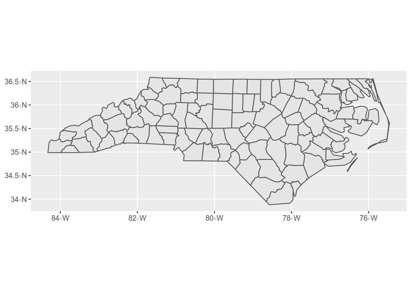
4.1.3 Mapping
4.1.3.1 A basic Map
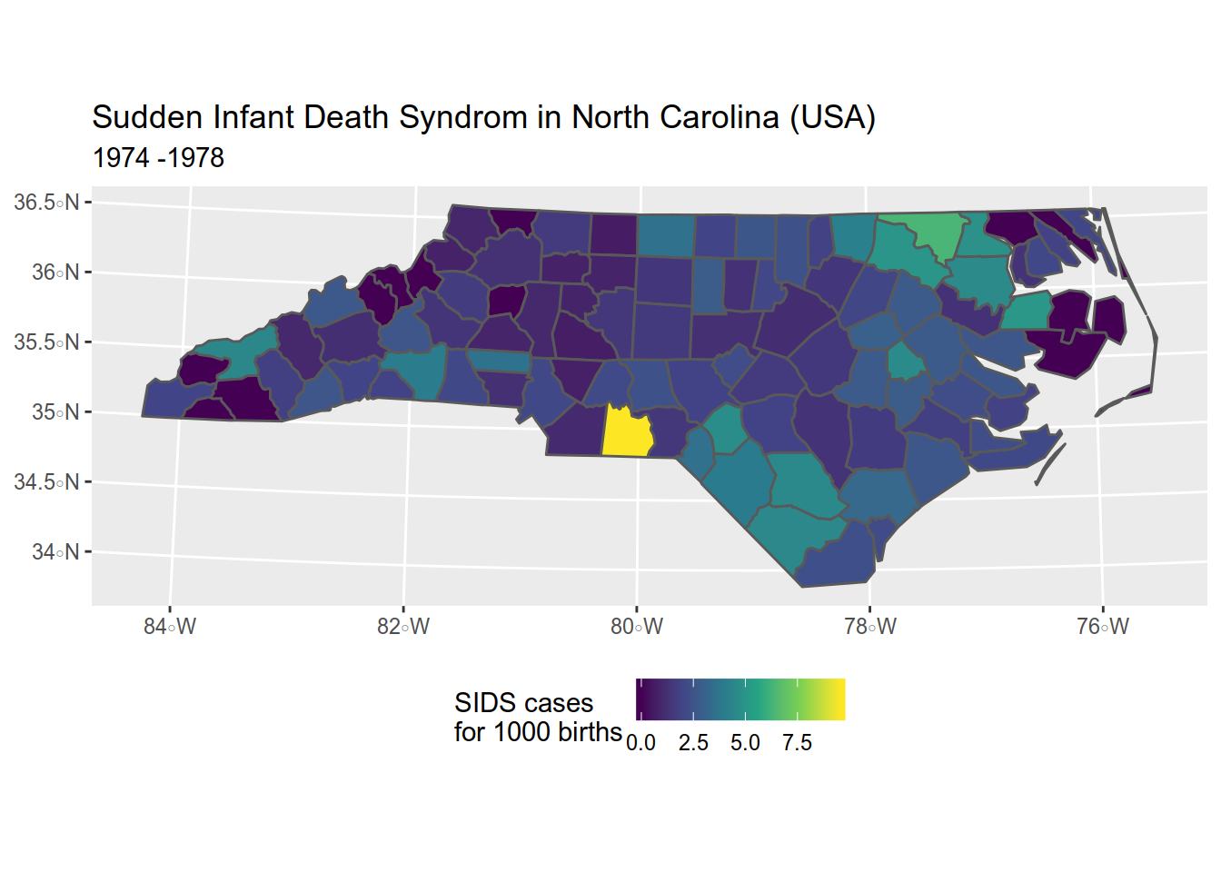
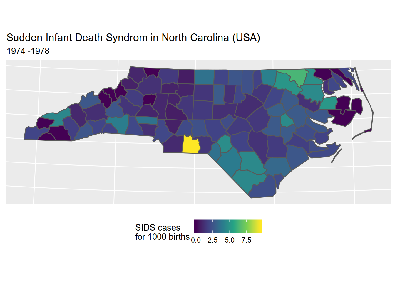
Let’s see what it looks :
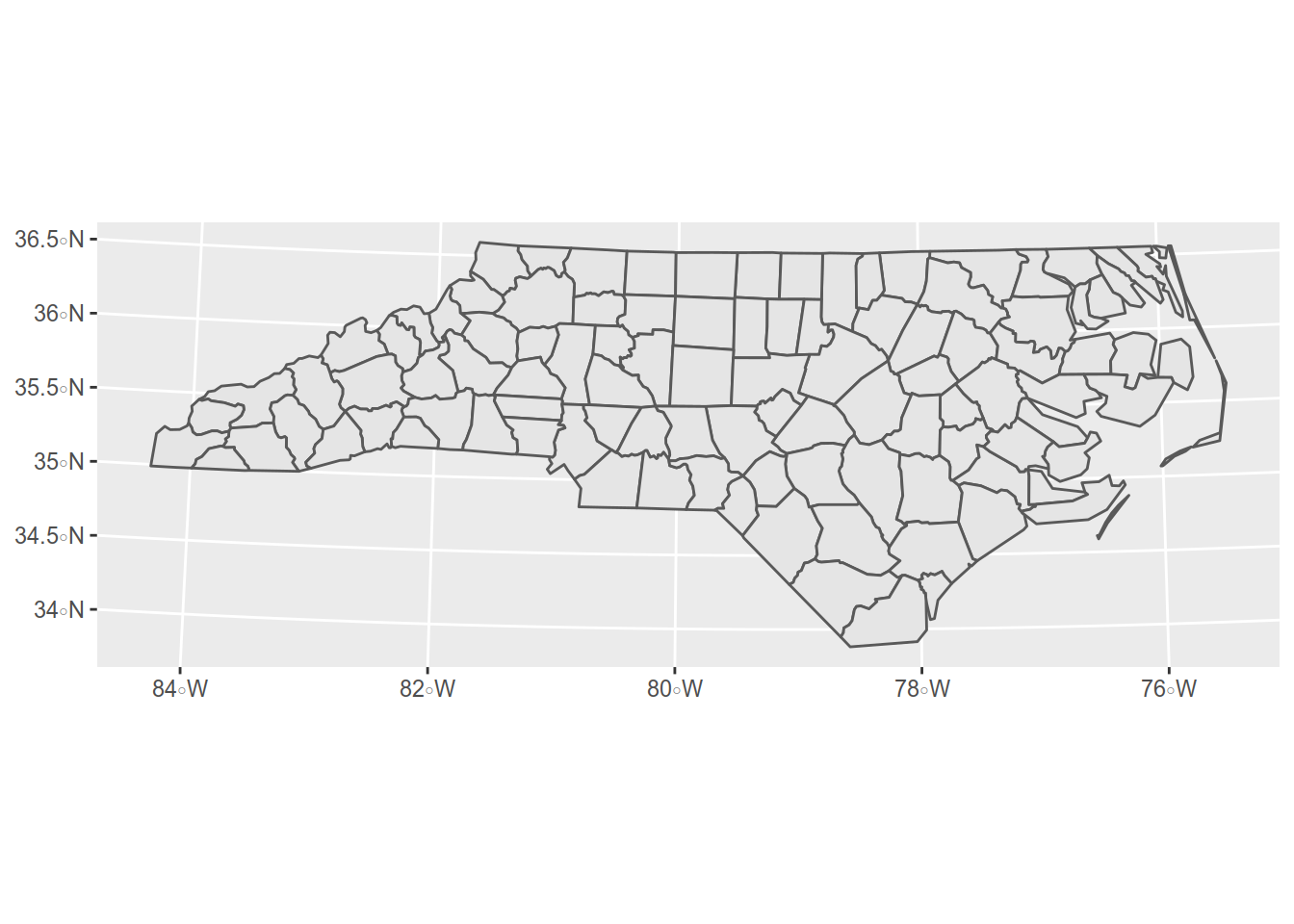
Well, let’s change the projection for a more fitted one of North Carolina: NAD83 / North Carolina (ftUS) - ESPG code: 2264
If we want to represent the rate of sids for the 1000 birth in the 1974 and 1978 period,
we will use the data from the BIR74 and SID74 columns.
In the original quickstart, they represent counts with colors, which is not the proper use, let’s use a ratio instead.
So we want to create a new column called sids_rate74 with the ratio.
## Warning in `[<-.data.frame`(`*tmp*`, "sids_rate74", value =
## structure(list(: provided 2 variables to replace 1 variables
Let’s see if our ratio is present:
## Simple feature collection with 6 features and 3 fields
## geometry type:  MULTIPOLYGON
## dimension:      XY
## bbox:           xmin: 1193233 ymin: 860658.5 xmax: 2951619 ymax: 1044116
## epsg (SRID):    2264
## proj4string:    +proj=lcc +lat_1=36.16666666666666 +lat_2=34.33333333333334 +lat_0=33.75 +lon_0=-79 +x_0=609601.2192024384 +y_0=0 +ellps=GRS80 +towgs84=0,0,0,0,0,0,0 +units=us-ft +no_defs
##   CNTY_ID        NAME sids_rate74                       geometry
## 1    1825        Ashe   0.9165903 MULTIPOLYGON (((1270761 913...
## 2    1827   Alleghany   0.0000000 MULTIPOLYGON (((1340498 959...
## 3    1828       Surry   1.5683814 MULTIPOLYGON (((1570525 910...
## 4    1831   Currituck   1.9685039 MULTIPOLYGON (((2881106 948...
## 5    1832 Northampton   6.3335679 MULTIPOLYGON (((2525610 911...
## 6    1833    Hertford   4.8209366 MULTIPOLYGON (((2665018 911...
How does it look like ? Lets add that to our map.
Here we will use several functions and parameters:
- ggplot(sids) -> we want to make plot of the SIDS dataset
- geom_sf(aes(fill = sids_rate74)) -> we want to apply aesthetics to the filling of the geometry using the data from sids_rate74 column
- scale_fill_viridis_c() -> with the viridis color scale dedicated to filling for continuous data
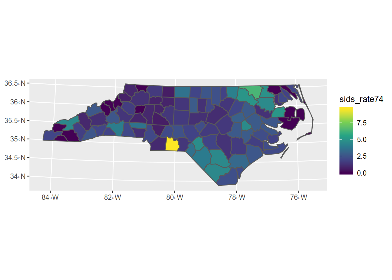
Not bad. Now we need some refinements like a title, some labels. Those functions are provided by {ggplot2}.
4.1.4 Making a better map
First we should store the map in an object so we won’t have to write all the code each time

4.1.5 Adding a title and a subtitle
map <- map + ggtitle(
  "Sudden Infant Death Syndrom in North Carolina (USA)", # title
  "1974 -1978" # subtitle
  )
map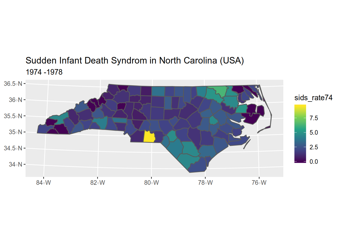
4.1.6 Exercice
Try to reproduce with the data from 1979 to 1984 (hint: use SID79 and BIR79).
4.1.7 Remarques about mapping with {ggplot2}
Despite its great compatibility with {sf}, {ggplot2} is a plot making package. To add decorations like a scalebar or the orientation, you will need to use another package, {ggspatial}. Working with the legend can be cumbersome sometimes.
There is several packages who tries to tackle this issue. The {tmap} package can make images and interactives maps with the same code.
{cartography}, in the other hand, can only produce images but of great quality.
4.2 cartography package
In the other hand, cartography is dedicated to maps, with specific functions.
{cartography} can use {sf} and {sp} object.
Its syntax is the one of plot(). You add layers one after another.
For example, to reproduce the SIDS map we did before,
Please not that, as {cartography} does not provide a viridis palette, we will be using its sand palette.
library(cartography)

# plot counties (only the backgroung color is plotted)
plot(st_geometry(sids), col = NA, border = NA, bg = "#aadaff")
# plot population density
choroLayer(
  x = sids, # dataset
  var = "sids_rate74", # variable to be mapped
  method = "fisher-jenks", # classification method:
                           # sd, equal, quantile,
                           # fisher-jenks, q6, geom, arith, em, msd
  nclass=5, # number of classes
  col = carto.pal(pal1 = "sand.pal", n1 = 5), # color palette
  border = "white",
  lwd = 0.5,
  legend.pos = "topleft",
  legend.title.txt = "SIDS\n(cases per 1000 births)",
  add = TRUE
)
# layout
layoutLayer(title = "SIDS cases - 1974-1978",
            sources = "Sources: Cressie, Read, Chan (1985-1991)",
            author = paste0("Roelandt, ", format(Sys.time(), "%Y")),
            frame = FALSE, north = FALSE, tabtitle = TRUE, theme= "sand.pal")
# north arrow
north(pos = "topright") # north arrow position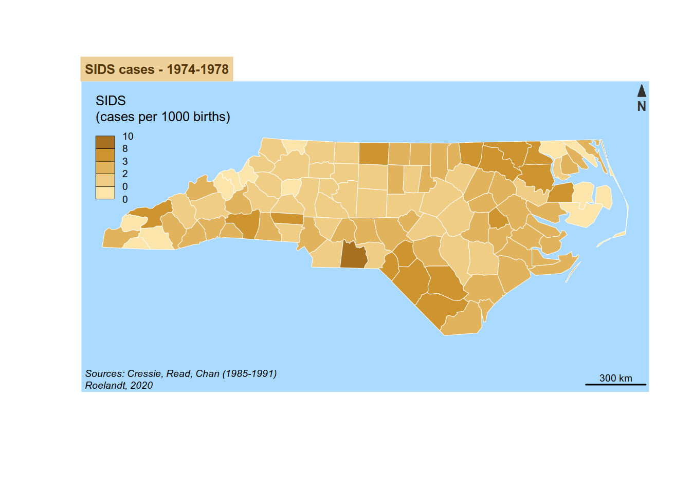
4.3 What’s next ?
Use {ggplot} facets to display the maps side by side for better comparison.
One thing you can do is use an OpenStreetMap basemap using Leaflet and make it more interactive for example.
Or display labels on the map.
There is a lot of documentation regarding R spatial but you might want to take a look at those ressources:
- Geocomputation with R by Robin Lovelace, Jakub Nowosad, Jannes Muenchow
- R Spatial by Edzer Pebesma
- Tidy spatial data analysis (video) by Edzer Pebesma at rstudio::conf 2018
- Introduction to mapping with {sf} & Co. on spatial analysis with R by Sebastien Rochette