Part 3 Plotting with ggplot2
Like the animation belows shows, making a plot with ggplot2 is like adding layers to a cake:
This is inspired by Gina Reynolds and Garrick Aden-Buie.
3.1 Adding layers to create a plot
For this example, we will use the iris dataset provided by ggplot.

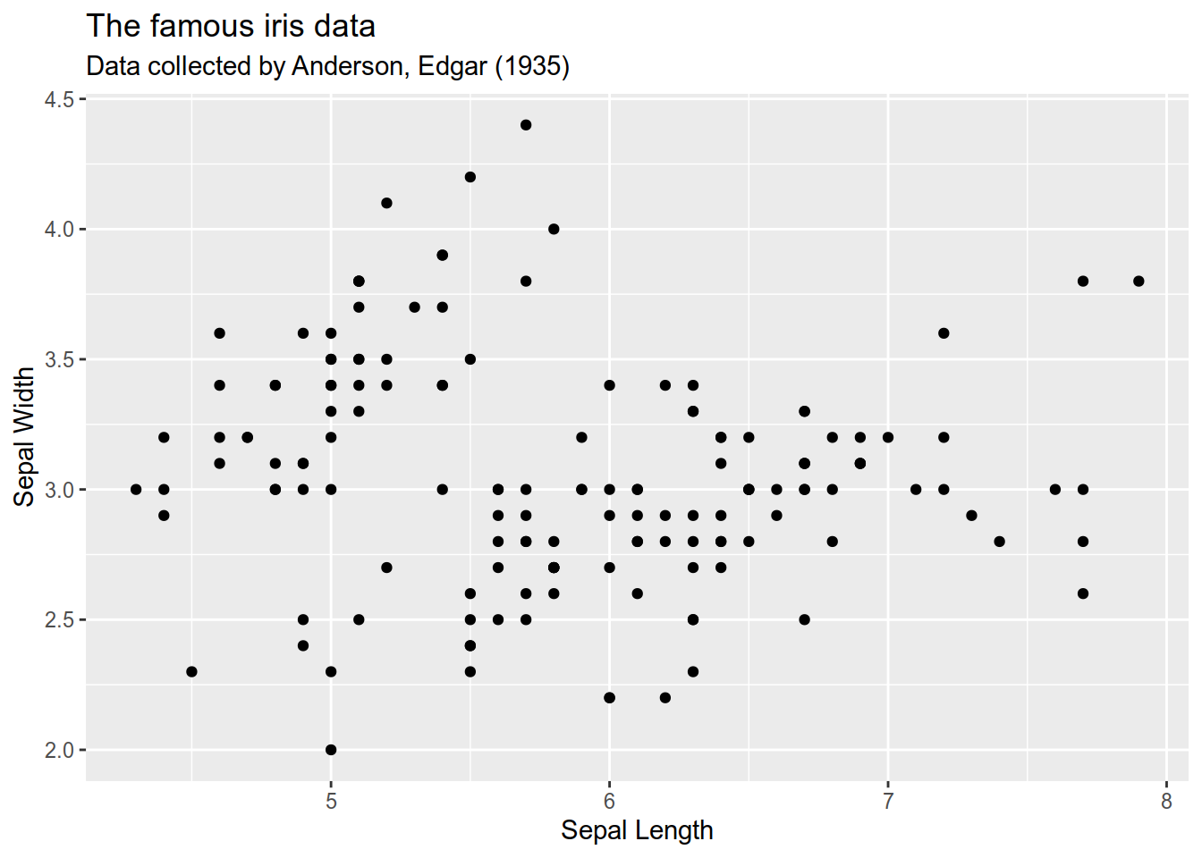
3.1.2 Define X and Y axis
Note: aes normally sits within the ggplot function!
You can also name parameters.
3.1.3 Adding a geometry
After defining what data will be used and the axis,
we can define a geometry. We want a scatterplot so will
use the geom_point() function.

There is several geom_* functions to create plots.
We will see a couple more later.
3.1.4 Add/Change labels
To change labels, you can use the labs() function.
3.1.4.1 X axis label

3.1.4.2 Y axis label
ggplot(iris) +
aes(Sepal.Length, Sepal.Width) +
geom_point() +
labs(x = "Sepal Length") +
labs(y = "Sepal Width") 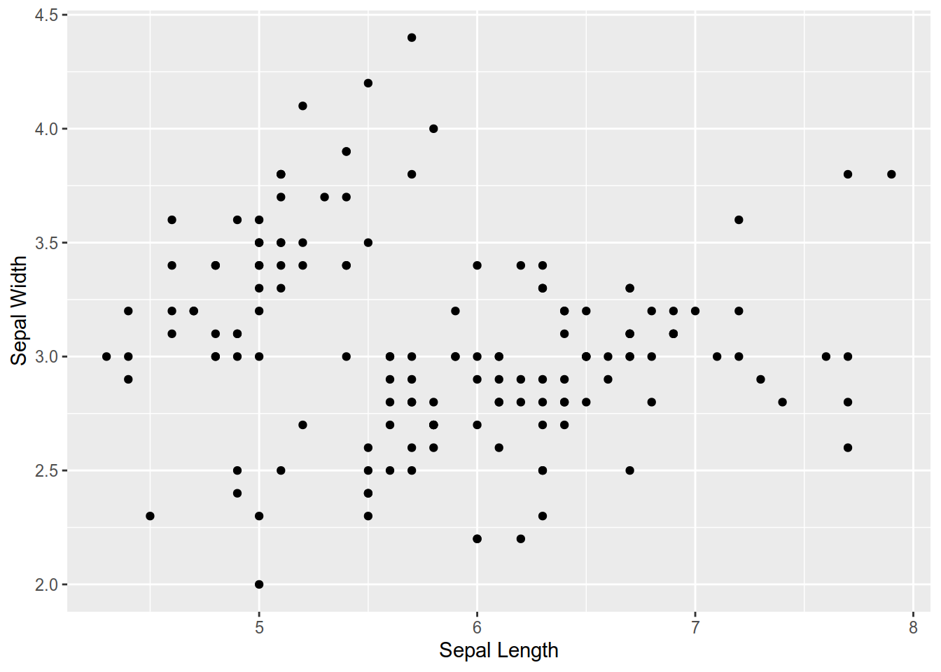
3.1.5 More options
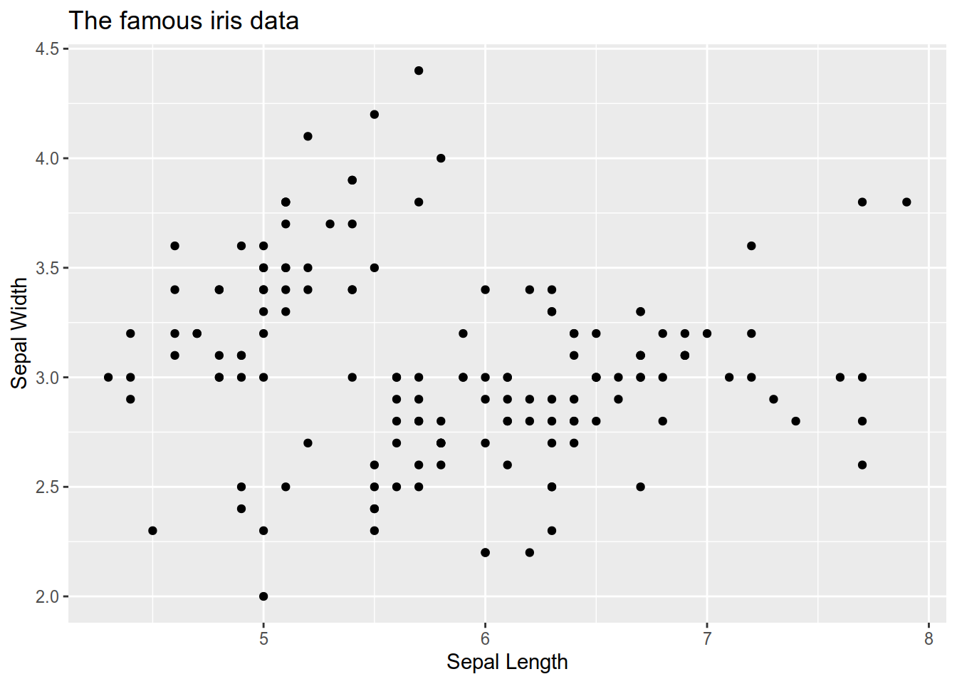
3.1.5.1 Define a color by specie
ggplot(iris) +
  aes(Sepal.Length, Sepal.Width) +
geom_point() +
labs(x = "Sepal Length") +
labs(y = "Sepal Width") +
labs(title="The famous iris data") +
labs(subtitle="Data collected by Anderson, Edgar (1935)") +
aes(color= Species) 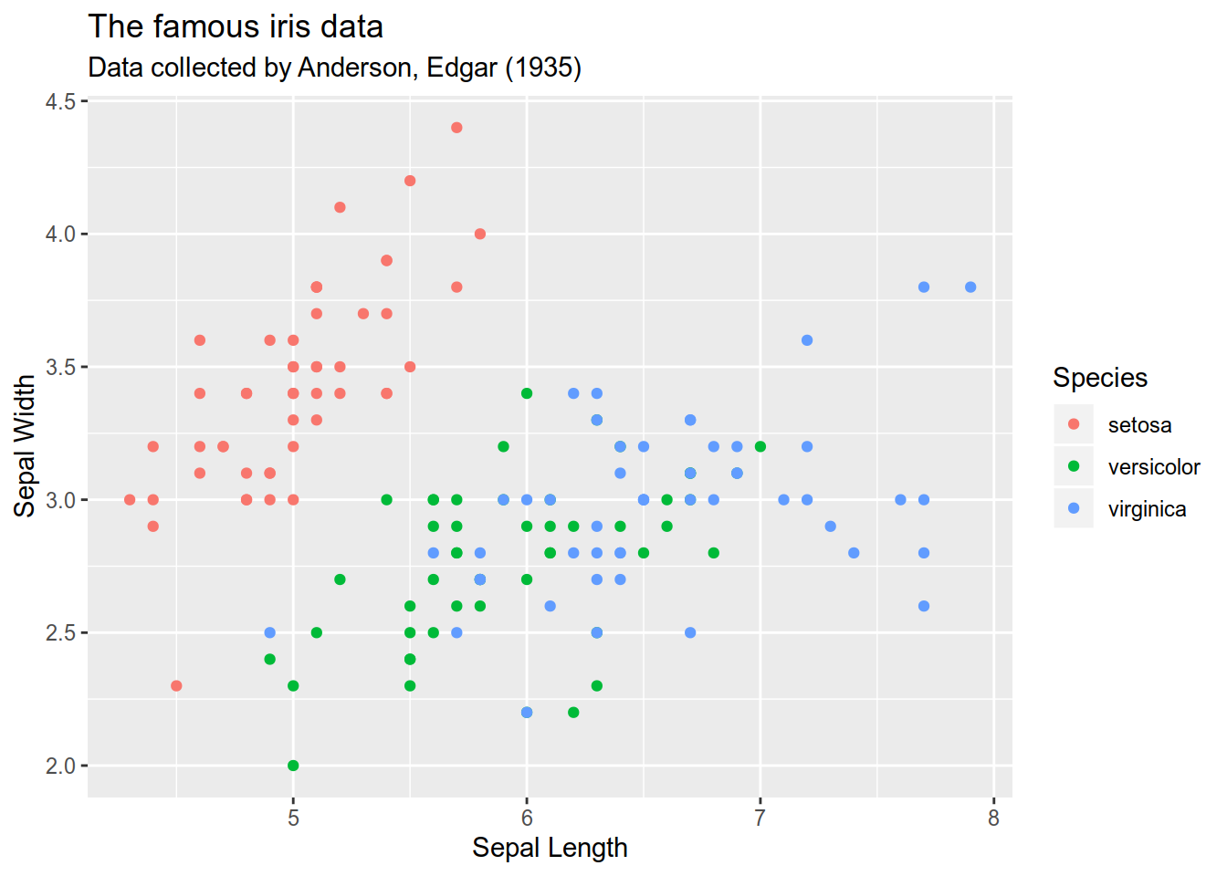
3.1.5.2 Change theme
ggplot2 comes with several themes (Black and white, dark, grey, minimal).
You can also create your owns that fits your corporate identity and style guide.
ggplot(iris) +
  aes(Sepal.Length, Sepal.Width) +
  geom_point() +
labs(x = "Sepal Length") +
labs(y = "Sepal Width") +
labs(title="The famous iris data") +
labs(subtitle="Data collected by Anderson, Edgar (1935)") +
aes(color= Species) +
theme_bw(base_size=16) 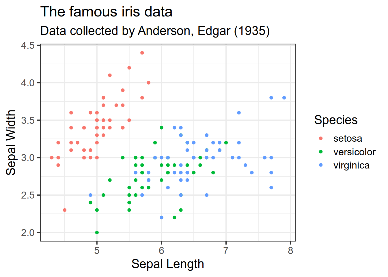
This is an example on how to build a plot in ggplot by adding layers. Let’s see some more.
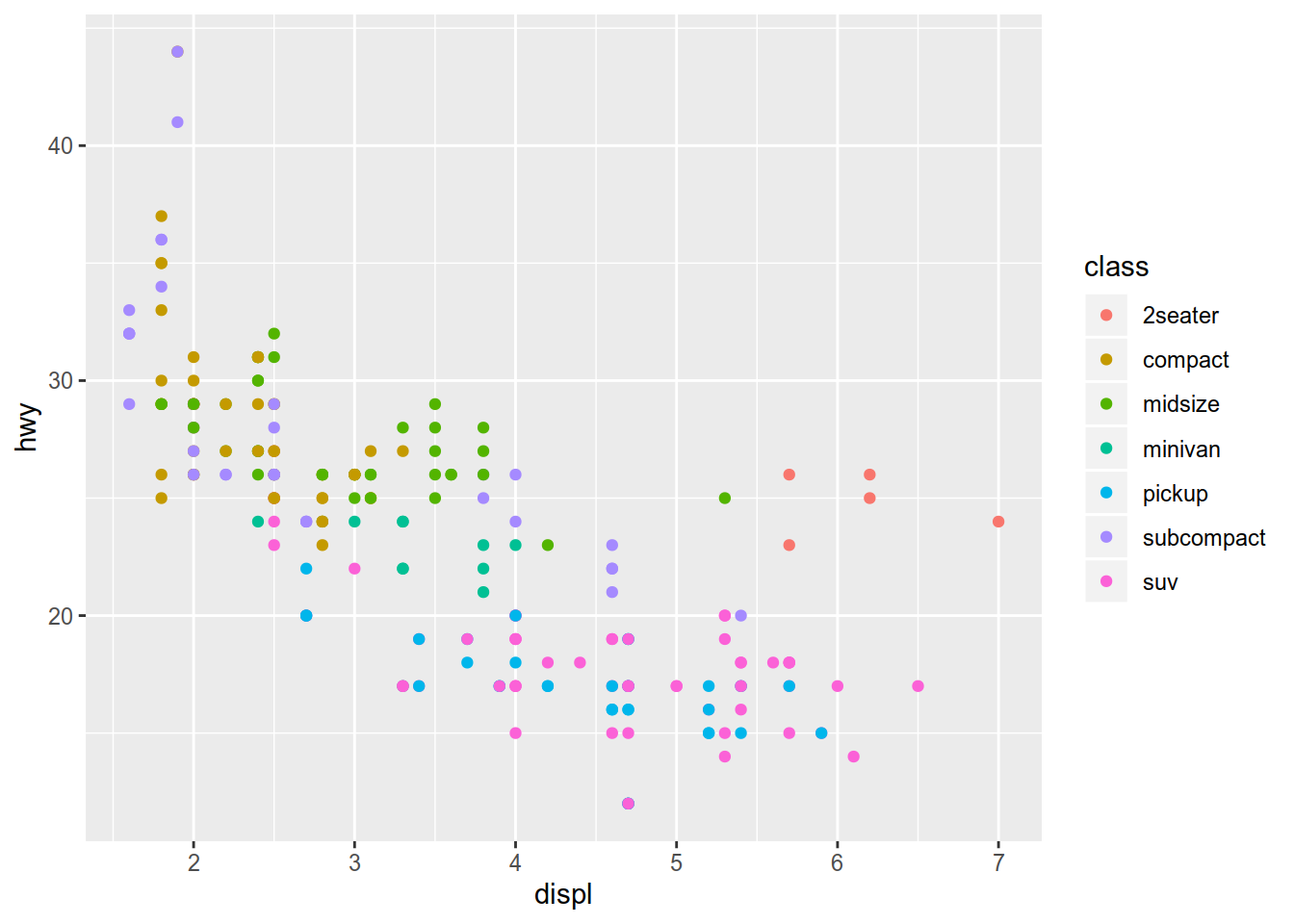
3.2 More examples with the mpg dataset
We will used the mpg dataset provided by the ggplot2 package.
3.2.1 The mpg dataset
This a subset on fuel economy data.
## # A tibble: 6 x 11
##   manufacturer model displ  year   cyl trans  drv     cty   hwy fl    class
##   <chr>        <chr> <dbl> <int> <int> <chr>  <chr> <int> <int> <chr> <chr>
## 1 audi         a4      1.8  1999     4 auto(… f        18    29 p     comp…
## 2 audi         a4      1.8  1999     4 manua… f        21    29 p     comp…
## 3 audi         a4      2    2008     4 manua… f        20    31 p     comp…
## 4 audi         a4      2    2008     4 auto(… f        21    30 p     comp…
## 5 audi         a4      2.8  1999     6 auto(… f        16    26 p     comp…
## 6 audi         a4      2.8  1999     6 manua… f        18    26 p     comp…
According to the documentation:
This dataset contains a subset of the fuel economy data that the EPA makes available on http://fueleconomy.gov. It contains only models which had a new release every year between 1999 and 2008 - this was used as a proxy for the popularity of the car. A data frame with 234 rows and 11 variables
- manufacturer
- model: model name
- displ: engine displacement, in litres
- year: year of manufacture
- cyl: number of cylinders
- trans: type of transmission
- drv: f = front-wheel drive, r = rear wheel drive, 4 = 4wd
- cty: city miles per gallon
- hwy: highway miles per gallon
- fl: fuel type
- class: “type” of car
3.2.1.1 Scatterplot
Let’s visualise it by display (displ), horse power (hwy) et class as a scatterplot.
3.2.1.2 Smooth curve
ggplot(data = mpg) +
  geom_point(
    mapping = aes(x = displ, y = hwy)
    ) +
  geom_smooth(
    mapping = aes(x = displ, y = hwy)
    )
## `geom_smooth()` using method = 'loess' and formula 'y ~ x'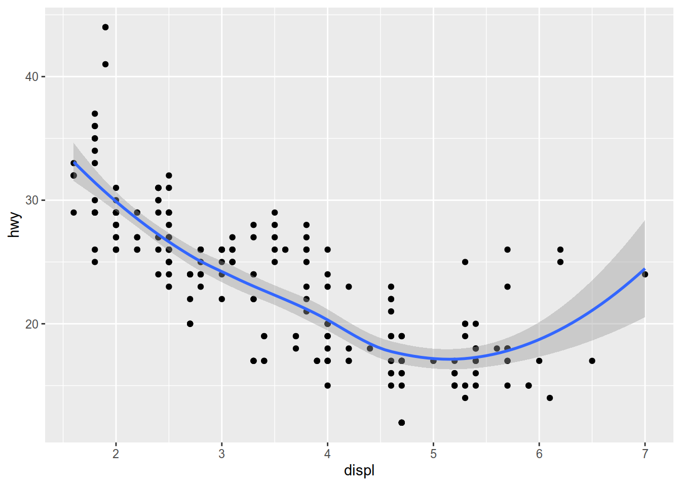
ggplot(data = mpg,
       mapping = aes(x = displ, y = hwy)) +
  geom_point(mapping = aes(color = class)) +
  geom_smooth(mapping = aes(color = class))
## `geom_smooth()` using method = 'loess' and formula 'y ~ x'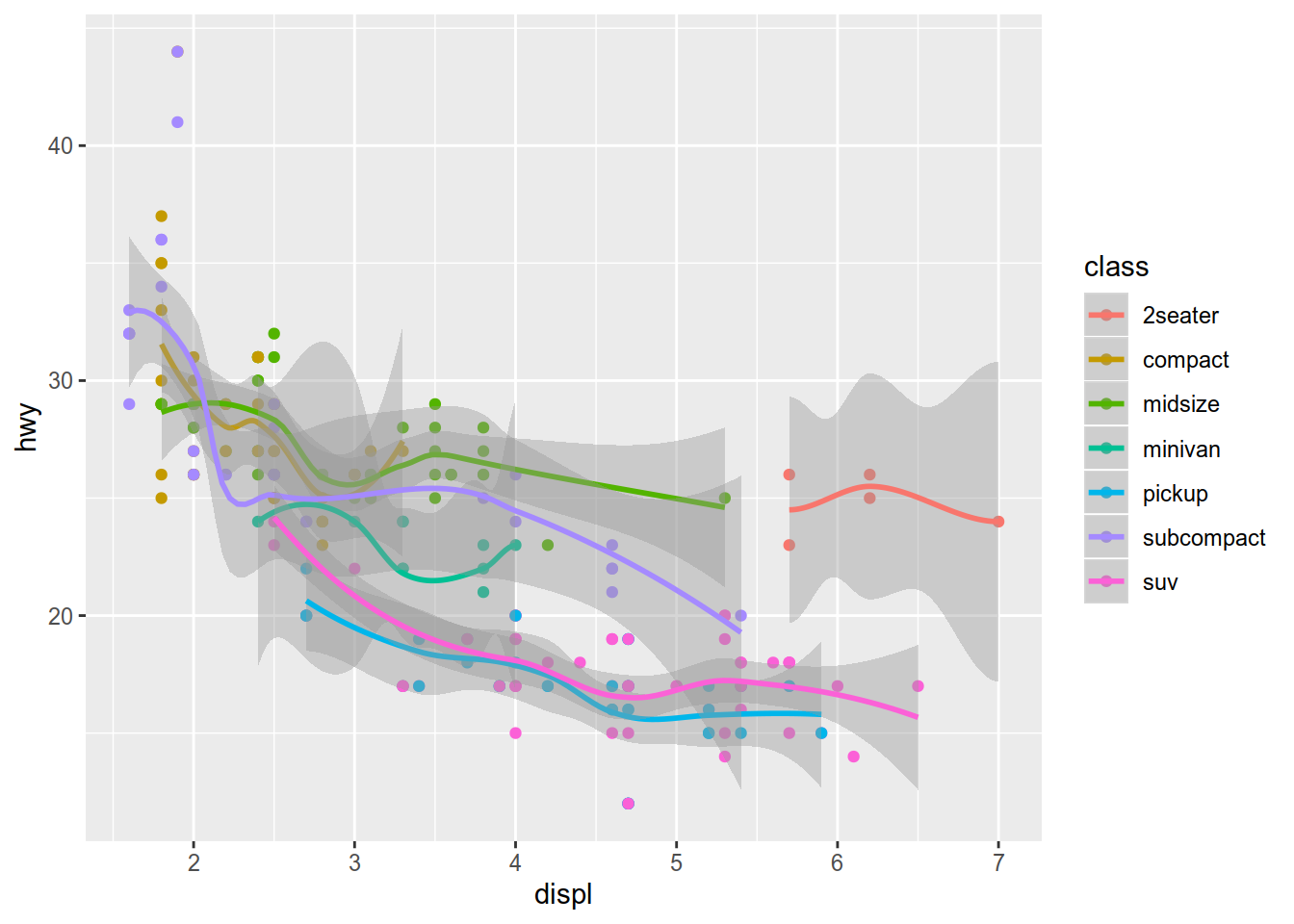
This example creates a lot of warnings that can be disabled by adding an option in the code chunk:
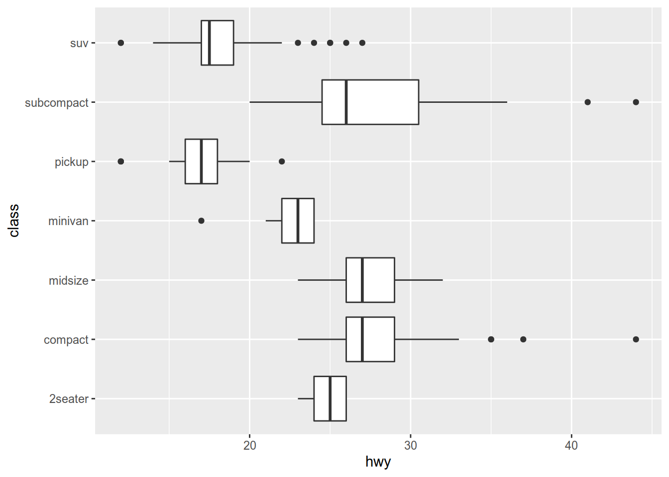
3.2.1.3 As a boxplot
Boxplot are great to visualise basics statistics (median, quartiles, etc.) and data distribution.
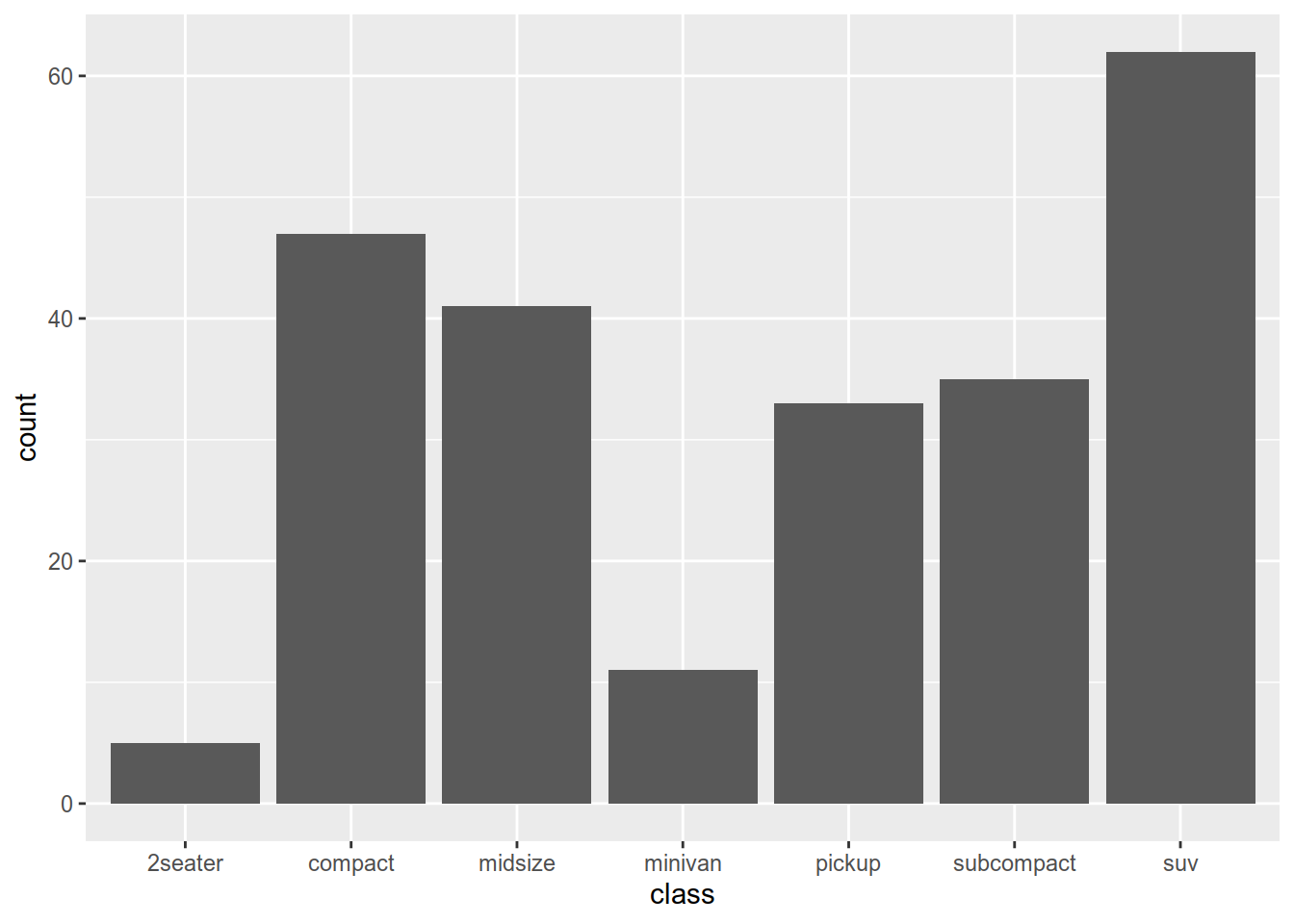
3.2.1.4 Histogram
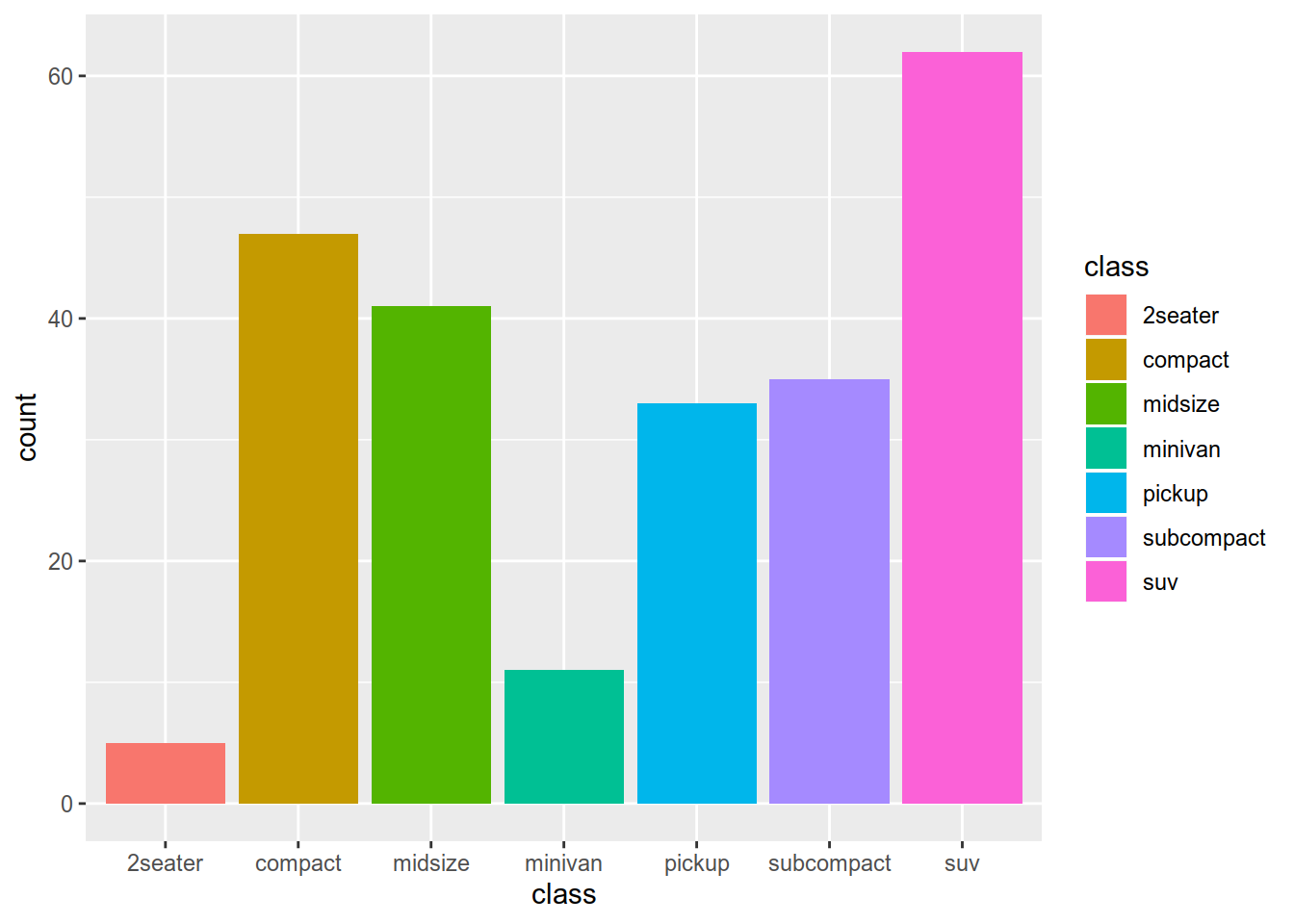
We want to see how is the distribution of motors by class.
The possibilities are abundant but you can’t apply each kind of plot on all dataset. To help you choose easily, you can use the esquisse package.

We know how to manipulate data and make plot from it. Let’s see how to do this with geospatial data.